
“Getting Started” might lead to installation instructions, basic commands, or a first project. A reader who needs one of those things should not have to guess which it is. Organize pages around the tasks people come to complete, and give each page a name and place that make its purpose clear.
Start with an inventory, not a menu
Before changing the menu, list the pages you have and the ones you plan to write. A spreadsheet will do. For each page, record a working title, a one-sentence description, the intended reader, and the task it supports. Mark it as published, outdated, or still an idea.
On a beginner programming site, the list might include “Install a Java development kit,” “Write a first Java program,” “Choose a code editor,” and “Understand Linux file permissions.” Put them side by side and gaps become easier to spot. Two Java installation articles may belong together; a first-program tutorial that assumes the development kit is installed may need a prerequisite link.
Resist assigning categories right away. First ask what each page is for. A comparison helps readers choose, a setup guide helps them prepare, a tutorial gets them through a task, and a reference lets them check details later. Readers look for each of those in different places.

Map the reader’s path through a task
Take a realistic goal: writing a first Java program. List what a newcomer needs to do—choose an editor, install the tools, create a file, run the program, and diagnose a common error. Match an existing page to each step. This gives you a task map, not a requirement to publish a separate article for every action.
The map may show that the site uses the publisher’s vocabulary where a beginner needs plain language. Someone looking for installation help might never open “Development Environments.” “Set up Java” or “Choose an editor” offers a clearer clue. Use technical terms in titles and explanations when they matter, but do not make knowing those terms a condition for finding a beginner guide.
Keep different kinds of pages distinct
- Overview pages explain what a subject covers and suggest where to start.
- Task guides lead readers through one outcome, such as installing a compiler or checking a local network setting.
- Concept explanations clarify ideas such as file permissions without presenting them as procedures.
- Reference pages hold details readers may want to check again, such as a short command glossary.
A page can do more than one of these jobs, but its main purpose should be obvious. Several screens of history before the first instruction slow down an installation guide. Numbering a concept explanation like a procedure can suggest there is something to do when there is not.
Give each page a predictable address
Once you have the task map, work out how the pages connect. A site with a few dozen guides may need only a small menu and a handful of overview pages. A larger site might need more levels, but each level should represent a useful relationship—not just another folder.
A “Java basics” overview, for instance, could point to installation, a first program, and common compilation errors. The first-program guide could link back to installation as a prerequisite and forward to an explanation of variables. Readers can then follow the subject without returning to the main menu after every page.
Name pages for a specific outcome or subject. “Install Java on Linux” is easier to recognize than “Java Setup Tips.” Keep URL paths readable and stable where possible. If a URL has to change, set up a redirect and update internal links so readers do not land on a missing page. The address helps, but the visible title and link text carry most of the meaning.
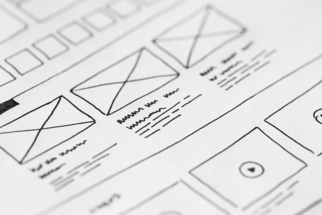
Make navigation and on-page structure work together
Keep the menu focused on broad destinations rather than listing every article. People also find pages through overviews, search results, and links within guides. Put a prerequisite link near the step that needs it, and say where it goes: “Install the Java development kit” is more helpful than “learn more.” Offer a next step at the end only if it follows from the task the reader just finished.
Headings need to describe what follows. In a setup guide, “Check the installed version” is more useful than “Verification.” Keep instructions for one step together instead of sending readers back and forth across the page. A short contents list can help on a long guide; on a short one, it may just get in the way.
Search is useful, but it cannot make inconsistent labels clear. If the menu says “Resources,” an overview says “Learning Hub,” and the page says “Beginner Tutorials,” readers must work out whether all three mean the same thing. Pick one term for each major destination and stick with it.
Test the structure with a small finding exercise
Ask someone new to the site to find three things without telling them the page titles: the steps to run a first Java program, an explanation of Linux file permissions, and what to check before following a network diagnostic guide. Notice where they look first and which labels make them pause. You are testing whether the site gives them useful clues, not how much they know about Java or Linux.
Write down routes that fail or cause hesitation. If several people look under “Linux basics” for a permissions guide filed under “Security,” add a clearly named route from the Linux overview. Avoid publishing a second copy of the guide: commands and recommendations can change, leaving the copies out of sync. Label defensive security guides involving tools or testing as intended only for systems readers own or are authorized to assess.
After making a change, check the affected links and repeat the finding task. For the Java example, start at the homepage and try to reach “Run your first Java program” without search. If you still have to guess what “Resources” means, rename it or add a direct link from the Java basics overview.