If a beginner needs to check whether a Linux service is running, show the status line they need to find—not a full desktop with terminal text too small to read. The image earns its place when it helps the reader locate or interpret something the prose cannot show as easily.
In programming and defensive security guides, a useful image might show a starting state, reveal how components connect, or help readers recognize a result. Images can also send readers astray. A screenshot from another software version may point to the wrong menu; a neat diagram may leave out a condition the task depends on. Before adding either, ask: what will the reader understand or do more accurately after seeing it?
Give each image a job
Look for the point where prose is doing too much work. Does the reader need to recognize a window, compare two states, find a route through an interface, or see how components connect? Give the image one main job:
- Orient: show where a setting, file, or panel sits within a larger interface.
- Identify: show the exact label, message, or state the reader should recognize.
- Explain: show a relationship that is hard to describe in a sequence of sentences.
- Compare: place two configurations or outcomes side by side so the distinction is visible.
- Verify: show what a successful result looks like, including the evidence that matters.
An IDE screenshot with the file tree open can orient a beginner looking for a Java source file. A close crop of an error message can help them identify a compiler failure. Those jobs need different framing. If neither image changes what the reader understands, leave it out.
Images also add little when they repeat a short, clear instruction. A photograph of a laptop beside advice on choosing an editor says little about the choice. A comparison table of supported languages, debugging tools, and setup requirements would be more useful.
Match the format to the information
Screenshots for interface-specific details
Use a screenshot when appearance matters: a menu path, dialog label, warning, or tool layout. Include enough of the surrounding interface to show where the detail belongs. A Linux desktop settings guide, for instance, may need the window title and nearby controls, but not the whole monitor.
Check the version as carefully as the crop. The screenshot should match the software version in the instructions, or its caption should say which version it shows. If menus differ by operating system, do not treat one view as universal. Explain the difference, add another view if it helps, or write instructions that do not depend on a particular layout.
Terminal output is often better as selectable text: readers can copy, enlarge, and search it. Reserve screenshots for cases where the arrangement matters, such as adjacent panes or the position of an indicator. Never put a command the reader must enter only in an image.
Diagrams for relationships and boundaries
A diagram can show why a network diagnostic and a local application check produce different results. Label the devices and connections, and make clear what the diagram simplifies. In a home-lab guide, showing a test machine, a virtual network, and an intentionally configured target makes the practice boundary visible. It should not imply that checks belong on unrelated systems.
Put labels close to what they describe. Use a directional arrow for traffic flow, but not for a connection with no stated direction. Define unfamiliar abbreviations in the text, and avoid decorative icons that make different components look alike.
Photographs for physical conditions
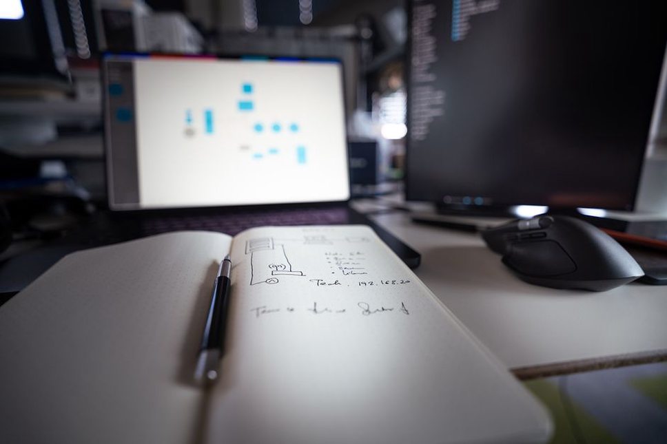
Use a photograph when the physical condition matters. A close view of cable labels can help with organizing a small test network. An angled photograph of an IDE on a laptop screen is a poor way to explain its settings: reflections and perspective make the text harder to read. Capture the screen directly when controls or output need to be precise.
Choose the moment, not just the subject
Two screenshots of the same interface can answer different questions. An empty project window shows a beginner where to start; a completed setup shows the expected file structure. A capture taken several steps later may show the right panel in the wrong state, making readers wonder whether they missed something.
Keep an image near the instruction it supports. Put a result check after the action that produces it. If readers need to understand a layout before following the next few steps, show it first. They should not have to scroll past unrelated instructions to compare their screen with yours.
Keep comparisons fair. If you show two editors, use similar tasks and zoom levels, with both labels visible. A welcome screen beside a debugger view could suggest a difference in capability that the images do not establish. Name the comparison criterion in the text instead of leaving readers to guess from appearance.
Protect accuracy and privacy before publishing
A real screenshot may still be unsafe to publish. Look for usernames, private paths, email addresses, IP addresses, browser tabs, and tokens pasted into a terminal. Inspect title bars, tabs, notifications, and the background—not just the area you meant to capture. Cropping helps, but it can leave sensitive details behind. Do not rely on blur to fix a capture containing secrets.
Recreate teaching examples in a disposable local environment with non-sensitive sample data. Use clearly fictional account names and paths; never paste real credentials into a sample terminal to demonstrate success. If an image shows a security finding, use an owned lab or authorized test and remove identifiers that do not help explain it.
Check what the image actually proves. A green indicator may show that a service is active, not that its configuration is safe. A completed scan shows that a tool ran, not that every reported issue is exploitable. Keep captions and prose within the limits of the visible evidence.
Record each visual’s source, the version it depicts, and your permission to publish it. For third-party images, check whether the license permits the intended use, including crops or annotations. A search result is not permission. An original screenshot or a simple diagram made for the guide often fits the explanation better than a generic photograph.
Make the information usable without the image
Put essential instructions in HTML text. Someone using a screen reader, viewing a small display, or browsing with images disabled still needs the setting name, command output, or point of comparison. A diagram may make an explanation shorter, but describe its key relationships in prose too.
Alt text should convey what matters, not announce that an image exists. For a screenshot, name the selected menu item and where it appears. For a diagram, describe the useful relationship—for example, that two lab machines share an isolated virtual network. If the caption already supplies the broader context, let the alt text focus on the visual distinction instead of repeating it.
Check labels at the size they will appear on the published page, including on a phone. If they are too small, crop closer, split the figure, or put values in an HTML table. Enlarging a low-resolution screenshot will not recover missing detail.
Keep annotations spare. One arrow can locate a setting; a cluster of bright boxes can obscure the interface. Label states “Before” and “After” rather than relying on color alone. When marking an error, leave enough of the original message visible for readers to recognize it on their own screen.
Use an image-selection check before publication
Review each proposed image against the instructions it supports, not against how appealing it looks in a folder:
- Name the reader task. Identify the step, concept, or outcome the image supports.
- State what it adds. If the paragraph already gives readers everything they need, remove the image.
- Check the crop. Show enough context without unrelated or sensitive details.
- Check the conditions. Match the software version, operating system, configuration, and stage of the task.
- Consider another format. Would selectable text, a table, or a short explanation be clearer?
- Check access and rights. Write useful alt text, inspect the displayed size, and confirm permission to publish.
Where possible, ask someone following the guide to point to the part of the image that answers the intended question. If they point somewhere else, revisit the crop, annotation, placement, or accompanying sentence.
In a beginner guide to checking a local test service, a useful crop might show the service name beside its active status. The text should explain that this confirms the service started, not that it is safely configured. If the status line is just as clear in selectable text, use the text and skip the screenshot.