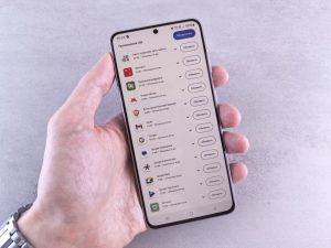
A code block that looks fine on a laptop can send a phone reader scrolling sideways to find the end of a command. Long lines aren't the only problem: cramped controls, intrusive banners, and text that won't reflow can make a useful post hard to read. Open an actual article on a narrow screen and read it all the way through. A homepage preview won't show you where the trouble starts.
Give the article a comfortable reading column
Body text should fit the available width without making the whole page scroll horizontally. Start with a responsive viewport setting and a fluid content container. Add enough side padding to keep letters off the screen edges, but not so much that a narrow phone shows only a few words per line.
Choose a legible body font and enough line spacing to keep lines distinct. No font size works for every typeface, though 16 CSS pixels is a reasonable starting point for normal text. Check the page at the phone's default settings, then increase the text size. Readers shouldn't have to keep their preferences untouched for the layout to work.
Set a maximum width for the article on larger screens, too; lines that stretch across a desktop display are tiring to read. Avoid fixed heights on paragraphs, cards, and navigation areas so translated labels and enlarged text have room to grow. Mozilla's guide to responsive design explains how flexible layouts and media queries work together.

Make the first screen useful
A tall site header can push a phone reader past the first screen before they see the title or opening paragraph. Keep the logo, navigation, search, and announcement bar proportionate to the reading task. A compact menu works if its label is clear and its controls are easy to use. An unexplained icon that hides every useful destination does not.
Make the title easy to spot, then show only the metadata readers need. An update date matters on a Linux setup guide, where commands can change. A long row of categories, sharing buttons, and author badges matters less before the first paragraph. If an ad or newsletter prompt takes up most of the screen, try moving it lower and see whether readers can reach the article without losing context.
Check sticky elements with the on-screen keyboard open and the phone turned sideways. A fixed header paired with a fixed promotion can leave almost no room for text. If a sticky control is essential, keep it small, make it dismissible where appropriate, and don't let it cover the content.
Write paragraphs that survive a narrow screen
A paragraph that looks moderate on desktop can fill a phone screen. Break it where the idea changes, not after a set number of sentences. Use headings that name actual steps or decisions: “Check the installed Java version” helps someone returning to a tutorial more than “Getting started.”
When readers need to perform a task, give them the action before a long explanation. Name the file to inspect, then explain what its contents mean and when the advice doesn't apply. Keep warnings beside the relevant step. In a defensive security tutorial, a command that must run only against a system the reader owns or is authorized to test needs that warning beside the command, not at the bottom of the page.
Lists work for short sequences and separate options, but they won't rescue dense writing. If a list item needs several paragraphs and nested sublists, a short section with its own heading may be easier to follow. Number steps when order matters; use bullets when it doesn't.
Handle code, commands, and tables deliberately
Keep examples readable without changing their meaning
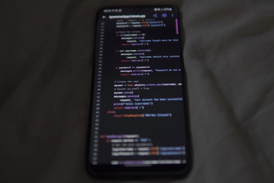
Code doesn't always wrap safely. A wrapped shell command can look like two commands, and a broken line of Java or C++ can be difficult to copy accurately. Put examples in separate code blocks with readable contrast and spacing. When a line needs to stay intact, allow horizontal scrolling inside the code block, not across the page. Give readers a subtle cue that the line continues.
Keep sample commands as short as the lesson allows. If a command needs a long path or several options, explain the important parts nearby rather than leaving readers to decode a dense line. Show a prompt only when it adds useful information, and make clear which characters to copy. A copy button can help with long examples, but it needs an accessible label and must not silently include a prompt or comment that makes the pasted command fail.
Don't shrink code until it barely fits. Test it with enlarged text, and make sure readers can select and copy it. Syntax color alone shouldn't have to distinguish input, output, or warnings.
Replace oversized tables when comparison is simple
A table comparing a few Linux commands may work on desktop and feel awkward on a phone. If each row holds only a name and explanation, try a definition-style sequence or short labeled paragraphs. If the relationship between several columns matters, keep the table in a clearly bounded horizontal scroll area. Where practical, keep headings visible or repeat their meaning in the cells. The article itself should never grow wider than the viewport.
Test tables with real content. A filesystem path, error message, or translated heading can reveal overflow that short placeholder text won't.
Make images support the text
Screenshots help when readers need to identify a button or compare a result. A full desktop screenshot scaled to phone width, though, is often unreadable. Crop to the relevant area while leaving enough context to find it. If several details matter, place separate images near their instructions instead of covering one image with tiny numbered callouts.
Put commands, paths, and error messages in actual text even when they appear in a screenshot. Readers may need to copy them, search the page, enlarge the font, or use a screen reader. Write alt text for information the image adds without repeating the adjacent paragraph. A caption can identify the application version or operating system when that distinction matters.
Resize and compress images so a phone doesn't download a large desktop asset for a small display. Specify dimensions or reserve space to prevent the page from shifting as images load. Lazy loading can help images farther down the page, but don't delay a top-of-page image so aggressively that readers see an empty gap.
Remove interruptions that break reading
Moving or overlapping elements are especially disruptive on a phone. An autoplay video, expanding ad, or subscription dialog can break a reader's place halfway through a command sequence. If a dialog is necessary, make it easy to dismiss without precise tapping and don't show it repeatedly during the same visit. Keep its dismiss button away from screen edges where browser controls may interfere.
Give links and buttons enough space that readers don't hit a neighboring control. Check the table of contents, footnotes, and pagination as carefully as the main menu. Make links distinguishable without relying on color alone, and keep keyboard focus visible for people using external keyboards or assistive technology. Mozilla's mobile accessibility guidance covers touch interaction and small-screen interfaces.
Page performance affects reading, too. Late font swaps, shifting images, and scripts that pause scrolling can make readers lose their place. Limit fonts and scripts, and test on a slower connection as well as office Wi-Fi. A page can load quickly and still be uncomfortable if its text keeps moving.
Test the article, not just the template
A browser's responsive preview catches layout errors, but a physical phone exposes problems with tapping, text selection, glare, and the browser interface. Check a narrow viewport, a larger phone viewport, and landscape orientation. If possible, repeat the test with enlarged text and a screen reader. The aim isn't identical layouts on every device; it's readable content in the right order.
Choose a few representative posts: a short text article, a long tutorial with code, and a post with images or a table. Work through each as a reader would:
- Start at the title. See how quickly the first useful paragraph appears and whether an overlay blocks it.
- Scroll at a normal pace. Look for jumping content, sticky controls covering headings, and paragraphs that feel too dense.
- Use the examples. Scroll a long code line, select a command, open an image, and follow an in-page heading link if there is one.
- Increase text size. Check that controls, captions, tables, and code still work without clipped text.
- Rotate the phone. Make sure the layout adapts and no dialog or fixed bar covers the article.
Fix problems that prevent reading before tuning small spacing differences. Page-wide horizontal scrolling, unreadable text, and a dialog that won't close take priority over an uneven section gap. After changing a shared template, revisit an older post with unusually long paths or screenshots; real content tends to reveal the edge cases.
For a final check, open the longest code-heavy post on a phone, enlarge the text once, and copy its longest command. If the whole page slides sideways or the copied text includes an unwanted prompt, fix that example before calling the mobile layout done.